Halaman

Minggu, 23 Oktober 2011

Infographic for U.S. Taxpayers

Is your Time Worth Enough to Prepare a U.S. Tax Return?

U.S. tax system nowadays is written in 70,320 pages long. I doubt there is a a single taxpayer out there would spent his/her time to read these pages, unless he/her is a tax consultant :p

Neil Patel, a well-known blogger, depicted the complexity of the U.S. Tax System in a nice infographic.

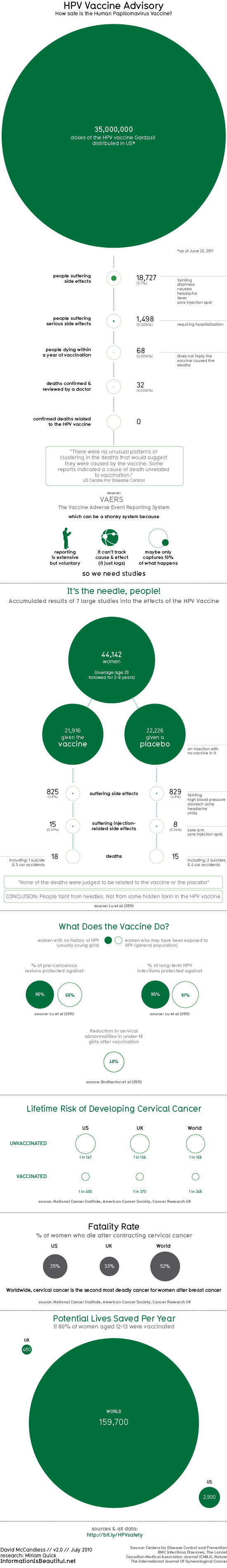
This infographic of U.S. Tax System Complexity uses green as dominant color with white background. It shows a clear message of time spent in preparing tax return is obviously not worth in regard to the amount paid.

Kamis, 20 Oktober 2011

HPV Vaccine Shots

How Safe HPV Vaccine Is?


The HPV vaccine (Human Papilloma Virus) deals with cervical cancer, genital warts, and some other less common cancers.The available HPV vaccines in the market are believed can be protect against 70% of cervical cancers, most HPV-induced genital and head and neck cancers.


The rumors of HPV vaccine failure are widely spread in the internet. There is unknown-sourced storiy of girls fainting after had a HPV vaccine shot. The rumor snowballed to branded the shot “as deadly as the cancer”.

The infographic of HPV Vaccine Advisory below shows us the comparison of cases of HPV shots resulted both in good and bad endings. It is made by Information is Beautiful, a web on designing data, and the data is taken from Centers for Disease Control and Prevention. The processed data can be accessed here: http://bit.ly/HPVsafety


The infographic simply tells all about HPV shots taken in 2011 (as June, not full year). I love the color and the scale.

Rabu, 19 Oktober 2011

U.S. Oil Consumption

The U.S. Oil Consumption infographic is made by the Christensen Law Firm. It shows you where the gas come from, and how do U.S. citizen use it. The graphic also depicts the comparative use between U.S. and other countries.

You can click the graphic below to visit the publisher site.


I think the size of the graphic is bigger than what we can be informed from it. The color used is too rich so it can be a distraction for the information it self. U.S.


If you like it, you can share it. The U.S. Oil Consumption infographic is licensed under a Creative Commons Attribution-NoDerivs 3.0 Unported License.

Selasa, 18 Oktober 2011

Visualization of Yahoo Email Processing in Real Time

How do emails flow in Yahoo Mail servers

Emailing is one of the most time- and resource-spending activity in the internet. Thus, it brings potential chances also. Here in Yahoo Mail Visualization, you can see how emails are served in real-time.


Why would someone need this kind of visualization? If you a marketer, or a businessperson, or someone who lived in information era, you are going to need this. We can sense the current changes of trending email topic. We can inferred to a potential chance either from good mail keywords or bad mail keywords (spam) as well.

The visualization is prepared by a firm named Periscopic. Not much firms can do this. Yahoo Mail Visualization is no other exception.

It is initially shown the world map view, but you can click to a specific region to zoom in. You can hear some sound from its animations. You can find some interesting facts about email also.

Here is the link:

Senin, 17 Oktober 2011

Visualization of Twits

Whatsup.uid.com provides an animated scatterplot visualization of twitter conversations.


Visualization of Twits informs us about the trending topics took place in twitter. The bigger the bubble, the bigger the conversation took place.

Whatsup Visualization is made by Uid.com (stands for User Interface Design GmbH). It is a Germany-based firm focused on designing user interface.

PS: Since the site uses Silverlight, you have to have it installed in your Windows installation. For Linux user, you have to install Moonlight.

Minggu, 16 Oktober 2011

Credit Card Charge Dispute

How Can I Settle My Credit Card Dispute?

This infographic is made by Credit Donkey, a credit card reviewer website that provide comparison of credit cards features.

Under U.S. law, there is still little known that consumers have rights to dispute questionable credit card charges. The question is, how big is the effort to do that? And, is it worth with the questionable charge? You can do this with little effort on your behalf.  Especially, If you know the process. Here is the Credit Card Charge Dispute infographic to make you easier to do such things.

Infographics: Credit Card Dispute Process
Courtesy of: CreditDonkey

Sabtu, 15 Oktober 2011

Obesity World Wide

How Bad Is Obesity Threating Our World?

This beautiful infographic gives us facts and numbers about obesity in global perspective. It is made by Actos Injury Lawyers, a law firm specialized in health cases.

++ Click to Enlarge Image ++
Obesity Worldwide | Infographic
Image Source: Actos lawyer

After reading this infographic about Obesity World Wide, we have a much better understanding about overweight. Hope that will inspire you to have a healthier lifestyle.